
THE HUMAN RELATIONSHIP WITH COLOR
At first there was nothing, and god said “let there be light”.
Then Newton said let it pass through a prism.
Back in the 1600’s, Newton was experimenting with optics and prisms, that’s when he came across what they used to call “Imaginary Colors”. In comparison to natural colors around humans, the colors encountered while using the prisms where very vibrant and fleeting. That’s why prisms used to be called “false paradises”, and Newton called the color range generated from the “Spectrum” which is Latin for Ghost.

These experimentations were the base of the development of our understanding of optics, light and its wavelengths, which led to the technicolor and RGB screen colors we use on a daily basis today.
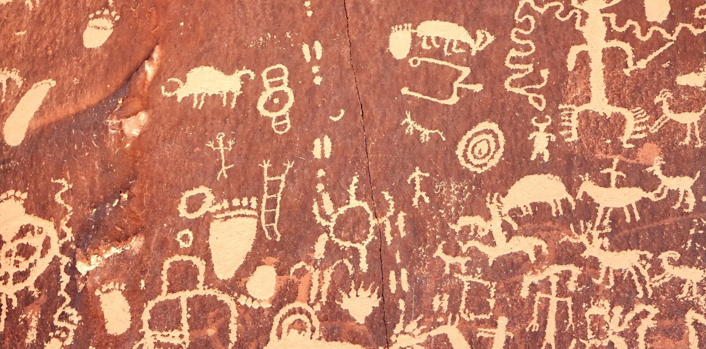
However, the relationship between humans and colors dates 40,000 years back. The first pigmentation observed on the walls of caves were only five: White, Black, Brown, Yellow, and Red. These five colors were obtained by different mixtures of soil, chalk, charcoal, and animal fat.
This relationship slowly evolved and our understanding of color developed to reach great depth and create clear psycho-optic structures. To understand them, we must start with basic Color101 knowledge.
All known colors can be broken down into the three primary colors: Magenta, Cyan, and Yellow.
These are the colors that can’t be obtained by mixing any other colors.
Secondary colors are the colors obtained when mixing the primary colors, and mixing these will give the tertiary colors.
And so on till we get the whole color wheel as we know it.
This wheel is very crucial for choosing color palettes in all aspects of art and design, a good website that guides with this task is color.adobe.com

To know what colors should be picked for a project, one must know the psychological and cultural aspects each color represents.
RED: While this color symbolizes honor in Russia, death in Africa, or even purity in India, in marketing red is the color of happiness because it’s a very stimulating pigment that humans react quickly too.
BLUE: This color is usually associated with sadness in a literary sense. It is even the color of death in Central and East Asia. In a marketing context, blue reflects intelligence and trust which is why it can be found, almost always, in brandings of doctors and medical institutions. That could be because the pigment’s wavelength reacts smoothly with the human eye, making it a soothing color. Blue is also the most common favorite color among people, as opposed to yellow which is the least common one.
PURPLE: Dating back to the 15th century BCA, this pigment used to be extracted from the murex shell in the Levantine area, or from plants in Eastern Asia. Both extraction methods required a complex process and a lot of manpower, which made the color very expensive and only affordable for the noble and high social classes. Which is why purple is still associated to this day with royalty wealth and nobility. This pigment’s rare appearance in nature linked it culturally to vanity and artificiality as well.
GREEN: A color with a rich and dark history, green pigments can be traced back to ancient Egyptian and Roman times. While it can reflect nature, life, rebirth and wealth, this color with polar opposites representations is also symbolic of poison, jealousy, envy and all inhumane creatures like dragons, monsters and witches. Green was the color of love in Medieval times but in 1775, the first artificial green pigment was created and used in Victorian home wallpapers. However, to obtain this color, this pigment was laced with arsenic, a very toxic substance, and this caused the sickness and death of many. It was then that green became the symbolic color of poison.

Nonetheless, even different shades of the same color can have various impacts. Therefore, choosing the right hue and saturation levels can really take the project into different directions.
This knowledge of color is crucial in order to build a strong structure for any design project, from graphic to interior design. An adequate color combination can go a long way in conveying a feeling, a space, a brand or a marketing campaign and can even have an important cultural impact. Hence, the next time you come across a color wheel, interact with it strategically, and most importantly don’t forget to have fun and get creative.